

There are many rumours and speculations across the web regarding the new algorithm update which will go into effect on 21st of April, 2015. Many site-owners (especially those who got most of their traffic organically from Google) wonder how those changes could change ranks of their websites and traffic volume, and, finally, how it would impact their businesses.
Starting April 21, we will be expanding our use of mobile-friendliness as a ranking signal. This change will affect mobile searches in all languages worldwide and will have a significant impact in our search results.
— Google Announcement
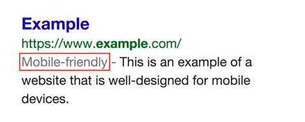
Even before this announcement, Google started sending website owners mobile usability warning notifications, launched website testing tool, added a mobile usability report in Google Web Toolkitand presented “mobile-friendly” labels in search pages.
Google doesn’t usually set exact dates of their algo changes and updates and hardly ever uses phrases like ‘significant impact’. So what really is there to expect? Is it important? Do you really need to bother? How to prepare your website and yourself for the upcoming changes?
Let’s check!
Figures behind changes
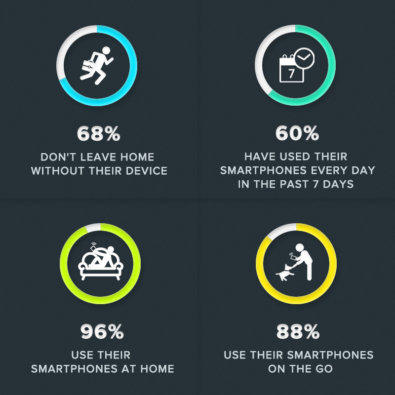
There is one word behind those changes: smartphone. When Steve Jobs introduced first iPhone in 2007 no one could have even imagined how popular and inseparable this piece of equipment would become. In 2010, Morgan Stanley predicted that mobile would surpass desktop within five years. Nowadays smartphones are an indispensable part of our lives, they strongly influence our behaviour and the way we live. This technology is widely adopted and is continuously on the rise.
In the USA, 94% of people with smartphones search for local information on their phones. Interestingly, 77% of mobile searches occur at home or at work, places where desktop computers are likely to be present.
— Google Developers Mobile Guide
Google wants to deliver excellent results responding to users’ search queries and needs. Usability is – aside from content – one of the key elements of successful user experience. They simply want to ensure that their users have the best possible experience.
When Google rolled out the Penguin algorithm and then Panda, it affected accordingly 4% and 12% of global searches on desktop and mobile. On a panel at SMX Munich, Google’s Webmaster Trends Analyst Zineb Ait Bahajji says, the new algorithm update will be even bigger.
Common reasons and elements Google will be looking at
- Text size easy to read. Appropriate font size, which means that on the smaller screen it’s properly scaled and it is easy to read on smaller screens.
- Links and buttons easy to tap. They should be easy to tap with your fingers and be spaced away from each other. Smartphone users mostly tap links with theirs thumb holding smartphone in one hand.
- Possibly no horizontal scrolling. The content shouldn’t be wider than the user’s screen.
- Mobile-friendly technology. Avoid technology like Flash which is a thorn in mobile browsers side. Additionally, when you have separate mobile URL (Note: Google recommends to use responsive design instead of second mobile-version of your website), redirect each user from desktop URL to mobile one.
- Speed and load time. It’s not a new issue, fast and optimized pages lead to higher visitor engagement, retention, and conversion.
Check your site. Is it mobile-friendly?
Use this online tools to check your website and see if it’s mobile-friendly. Those tools also give you hints and action steps so you’ll be able to fix occurring problems.
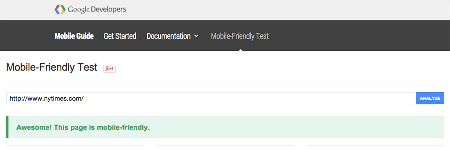
- Mobile-Friendly Test. This test gives you a quick overview. Paste your URL and run a test. If your website passes, you will see a green banner which indicates that the website is mobile-friendly. If your website doesn’t pass, you will see the reasons why.
Google has been clear that Mobile-Friendly test results are binary, meaning that your page is either Mobile-Friendly or it is not. There is no 50% or 70% Mobile-Friendly result possible—no middle ground. They have also taken care to specify that Google’s Mobile-Friendly evaluations are somewhat instant, implying that there is no proving-time or “sandbox” associated with the tag, but this could be somewhat misleading. There may be no intentional time-delay before a page is awarded the Mobile-Friendly notation, but it will only change after a crawl of the site indicates that the page is now Mobile-Friendly, so it is close to instantaneous if the pages are getting crawled on a very regular basis. — Moz.com
- Mobile Usability Report. Use Google Webmaster Tools to get a full list of issues and a more detailed analysis of your website.
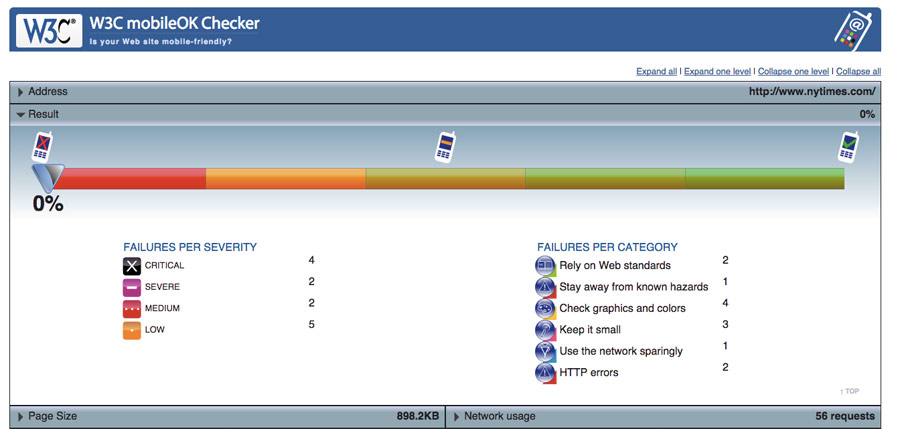
- W3C mobileOK Checker. W3C’s tool provides you more technical information and recommendations.
Shorte.st is ready for changes
We would like you to have the best experience possible cooperating with us so we took care of our ad placements. Now your mobile users have great experience as our interstitial and overlay ads are user-friendly.
SEE ALSO
- Google Webmasters Youtube Channel – Q&A session for mobile-friendly ranking change
READ MORE
- Mobile Guide by Google Developers
- Mobile Optimization and the Google Algorithm Change – 7 Steps to Stay Friendly
- 9 Things You Need to Know About Google’s Mobile-Friendly Update
The article source : shorte.st
Earn money on short links. Make short links and earn the biggest money – Shorte.st links


